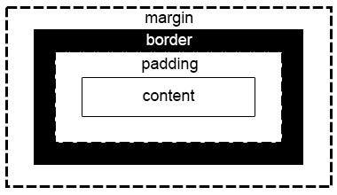
The CSS Box Model refers to the "box" that surrounds each element of an HTML page. This box consists of four parts: content, padding, border, and margin. The image below gives an example of this box.
Adding margins to CSS is easy. We can assign top bottom left and right all at once or one at a time. Using "padding: w x y z" will assign all at once while something like "padding-left: x" will assign just the left margin.
The Box Model helps us space elements in our page how we want. It's important to remember that the padding and margin are transparent and are only used to separate the content from the border and the border from the next element in the page. There will be examples of different padding sizes and margin sizes down below.
padding: 20px 20px 20px 20px; Lorem ipsum dolor sit amet, consectetur adipiscing elit, sed do eiusmod tempor incididunt ut labore et dolore magna aliqua. Quam quisque id diam vel quam elementum pulvinar. Tristique magna sit amet purus gravida quis blandit.
padding: 20px 60px 20px 60px; Lorem ipsum dolor sit amet, consectetur adipiscing elit, sed do eiusmod tempor incididunt ut labore et dolore magna aliqua. Quam quisque id diam vel quam elementum pulvinar. Tristique magna sit amet purus gravida quis blandit.
padding: 100px 80px 60px 40px; Lorem ipsum dolor sit amet, consectetur adipiscing elit, sed do eiusmod tempor incididunt ut labore et dolore magna aliqua. Quam quisque id diam vel quam elementum pulvinar. Tristique magna sit amet purus gravida quis blandit.
Adding margins to CSS is simple too. We can assign top bottom left and right all at once or one at a time. Using "margin: w x y z" will assign all at once while something like "margin-left: x" will assign just the left margin.
default margin; Lorem ipsum dolor sit amet, consectetur adipiscing elit, sed do eiusmod tempor incididunt ut labore et dolore magna aliqua. Quam quisque id diam vel quam elementum pulvinar. Tristique magna sit amet purus gravida quis blandit.
margin-left: 60px; Lorem ipsum dolor sit amet, consectetur adipiscing elit, sed do eiusmod tempor incididunt ut labore et dolore magna aliqua. Quam quisque id diam vel quam elementum pulvinar. Tristique magna sit amet purus gravida quis blandit.
margin-left: 180px; Lorem ipsum dolor sit amet, consectetur adipiscing elit, sed do eiusmod tempor incididunt ut labore et dolore magna aliqua. Quam quisque id diam vel quam elementum pulvinar. Tristique magna sit amet purus gravida quis blandit.
Many websites use this trick to make buttons pop and to help guide the user. Using CSS we can change the style of an element when the user hovers their cursor over it! Below are some examples of how to do this and what it will look like. Hover over the three boxes below to see how they change!
No hover style; Lorem ipsum dolor sit amet, consectetur adipiscing elit, sed do eiusmod tempor incididunt ut labore et dolore magna aliqua. Quam quisque id diam vel quam elementum pulvinar. Tristique magna sit amet purus gravida quis blandit.
.hov2:hover{ background-color: #00FFFF; transition-duration: 4s; } Lorem ipsum dolor sit amet, consectetur adipiscing elit, sed do eiusmod tempor incididunt ut labore et dolore magna aliqua. Quam quisque id diam vel quam elementum pulvinar. Tristique magna sit amet purus gravida quis blandit.
.hov3:hover{ width: 600px; height: 600px; transition-duration: 2s; } Lorem ipsum dolor sit amet, consectetur adipiscing elit, sed do eiusmod tempor incididunt ut labore et dolore magna aliqua. Quam quisque id diam vel quam elementum pulvinar. Tristique magna sit amet purus gravida quis blandit.
Web accessibility relies on competent color contrast. Websites are easy to navigate for the user when colors contrast in an eye-catching way. Below is a table that gives examples of good color contrast choices and examples of poor color contrast choices as well.
| Text | Background Color | Text Color | Contrast Ratio | Rating |
|---|---|---|---|---|
| Lorem ipsum dolor sit amet, consectetur adipiscing elit, sed do eiusmod tempor incididunt ut labore et dolore magna aliqua. | #FFFFFF | #0000FF | 8.59:1 | AAA |
| Lorem ipsum dolor sit amet, consectetur adipiscing elit, sed do eiusmod tempor incididunt ut labore et dolore magna aliqua. | #FFFFED | #555DF7 | 4.83:1 | AA |
| Lorem ipsum dolor sit amet, consectetur adipiscing elit, sed do eiusmod tempor incididunt ut labore et dolore magna aliqua. | #E7EFF6 | #006855 | 5.8:1 | AA |
| Lorem ipsum dolor sit amet, consectetur adipiscing elit, sed do eiusmod tempor incididunt ut labore et dolore magna aliqua. | #F00A64 | #FF0000 | 1.06:1 | NONE |
| Lorem ipsum dolor sit amet, consectetur adipiscing elit, sed do eiusmod tempor incididunt ut labore et dolore magna aliqua. | #7ED164 | #F0D164 | 1.25:1 | NONE |
We can use position to change where on our web page certain elements are. The three types of positions covered here are relative, absolute, and fixed. There will be examples below of how to implement each of these and when to use them.
Elements with "position: relative;" are positioned relative to their normal positions. Surrounding elements will not be adjusted to fit any gap left by the element.
Elements with "position: absolute" base their position on the nearest positioned "ancestor". Relative position uses the viewport for reference for comparison. If the element with absolute positioning has no ancestors it will use the document body as its ancestor and moves along with the page as you scroll. Below is an example of relative compared to absolute. Notice how the absolute box overlaps the relative box.
Elements with "position: fixed;" are positioned relative to the viewport which means they stay in the same place no matter where you scroll. You've likely noticed the gray box with a question mark in the bottom right corner of this page. That image has "position: fixed;"!
CSS can be used to add shadow effects to text or boxes. Here we will use text to highlight how this is done. We use "text-shadow: x y z" where x is horizontal offset, y is vertical offset, and z is blur intensity.
.horizontal1{ font-size: 32px; text-shadow: 2px 2px; }
YOUR TEXT HERE
.horizontal2{ font-size: 32px; text-shadow: 7px 2px; }
YOUR TEXT HERE
.vertical1{ font-size: 32px; text-shadow: 2px 2px; }
YOUR TEXT HERE
.vertical2{ font-size: 32px; text-shadow: 2px 7px; }
YOUR TEXT HERE
.blur1{ font-size: 32px; text-shadow: 2px 2px 3px; }
YOUR TEXT HERE
.blur2{ font-size: 32px; text-shadow: 2px 2px 10px; }
YOUR TEXT HERE