Style CSS
This page is to teach people how to use CSS to apply into there own codeing projects.
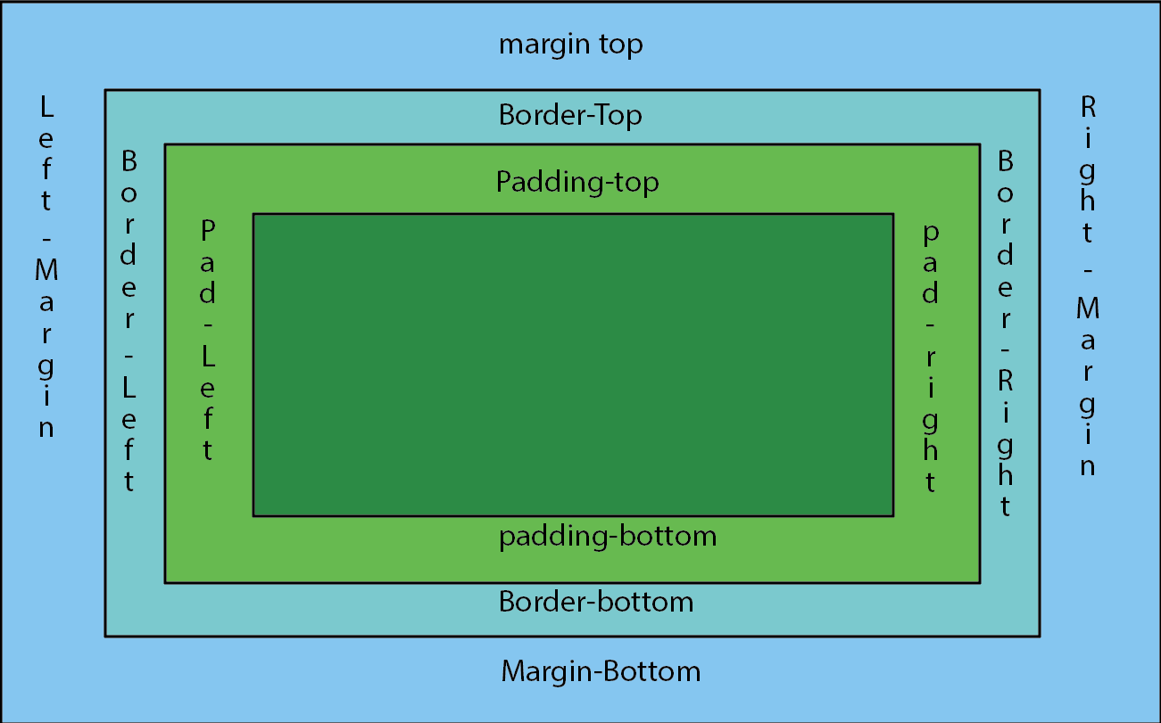
This padding has all the sides the same. they all equal 50px. As you can see the words are the same distence away from the edges. To do this you Only need to put padding: 50px.
This padding has the Top Bottom and left different. They all equal
50px. As you can see the
words are the same distence away from the edges. To do this
you only need to put:
padding-top: 30px;
padding-left: 30px;
padding-bottom: px;
In this example you can see that the sides are all different. The
padding forces the text to move away from the margins
padding-top: 70px;
padding-right: 50px;
padding-left: 10px;
padding-bottom: 5px;
This padding has all the sides the same. they all equal 50px. As you can see the words are the same distence away from the edges. To do this you Only need to put padding: 50px.
This padding has the Top Bottom and left different.
They all equal 50px. As you can see the
words are the same distence away from the edges. To do this
you only need to put:
padding-top: 50px;
padding-left: 50px;
padding-bottom: 60px;.
In this example you can see that the sides are all different. The
padding forces the text to move away from the margins
padding-top: 70px;
padding-left: 10px;
padding-bottom: 8px;
padding-right: 75px
A Hover style is done by putting :hover after the class name in CSS. This forces the tag to do something special when you hover over it.
This one has no hover, so that you can tell the difference between the transition properties. See the next two...
This is a div with a hover, which changes the color I did this by
creating a separate div that has a different back-ground color.
EX:
div.special2:hover
{
background-color: #A6BFC7;
border: 10px double #999;
}
This is a div with a hover, which changes the size I did this by
creating a separate div that changes the scale of the div.
it goes up by 1.15px.
EX:
div.special3:hover
{
transform: scale(1.15);
right: 100px;
}
| Text | lorem ipsum | lorem ipsum | lorem ipsum | lorem ipsum | lorem ipsum |
|---|---|---|---|---|---|
| Background | |||||
| Text Color | lorem ipsum | lorem ipsum | lorem ipsum | lorem ipsum | lorem ipsum |
| Contrast Ratio | 7.37:1 | 4.61:1 | 6.54:1 | 1.52:1 | 1.2:1 |
| Rating | AA & AAA | AA | AA | Fail | Fail |

The relative image has double line. so the one above this text. the relative position is similar to the fixed, but the relative posistion is relative to itself. This means it stays in the same place even when ajusting the screens length.(Double line)

This make the picture stay in the same spot of the screen. This allows you to see it even when you scroll down or up. It even stays in the same spot when adjusting the screen. You need to be carul that it doesn't block anything.(Solid line)

This one has appear to be similar to absolute, but once you ajust the screen it moves with the page so that it stays on the screen. This method can cause problem with text some times. This one has a dashed line.
So this box has been manipulated to have a horizontal shadow
to the right of the box. This shadow has no blur.
As you can see it has a sharp line.
EX:
box-shadow: 10px 0px 0px #000;
This Box has been manipulated to have a vertical shadow.
As you can see there is a shadow at the bottom with a 5px blur
EX:
box-shadow: 0px 10px 5px #000;
The Blur affect makes the offset of the box look blured.
To get blur of all sides you must add negatives to
offset the other sides.
EX:
box-shadow: 10px 10px 20px #000, -10px -10px 20px #000;